
Diraba — felt
Raised printing (intaglio)
Printing that feels rough to the touch, because the ink stands above the surface of the material.
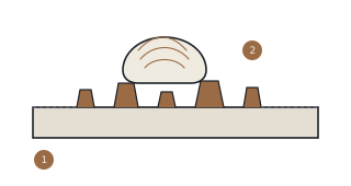
The ink does not sink flat into the material. It remains as a ridge standing above the surface — and that ridge is what a fingertip reads.
- The ink stands above the plane of the surface rather than level with it. That difference in height is the entire feature.
- A fingertip is highly sensitive to abrupt changes in height. That is why Bank Indonesia places this feature on the diraba channel rather than dilihat.
What to observe
- Run a fingertip over the main image, the hero portrait, the denomination numerals, and the state emblem. They feel rough, not flat like ordinary paper.
- Moving a fingertip sideways usually reads more clearly than pressing straight down: the fingertip reads the edge of the relief, not its height.
This page explains how to check a feature, not how one is produced. Nor does this site say whether any note is genuine — that authority rests with Bank Indonesia.
Sweep the light
A screen cannot convey touch, but it can show the other consequence of raised printing: ink standing above the surface catches light from a low angle and shadows the far side. Move the light around.
20°
The surface here is a run of plain ridges, not the engraving on any note. It shows how relief catches light — it is not a substitute for feeling it. For that, still take out a note.
Sources
- Bank Indonesia — Gambar Uang — Rp100.000 Tahun Emisi 2016, Unsur Pengaman ↗open source: Gambar Uang — Rp100.000 Tahun Emisi 2016
- Artech House — R. L. van Renesse, Optical Document Security, 3rd edition (2005), Ch. 2, Intaglio printing